CU on campus
What Rebranding, UX, campaign
Where Stereo Associates
How Strategy, creative direction
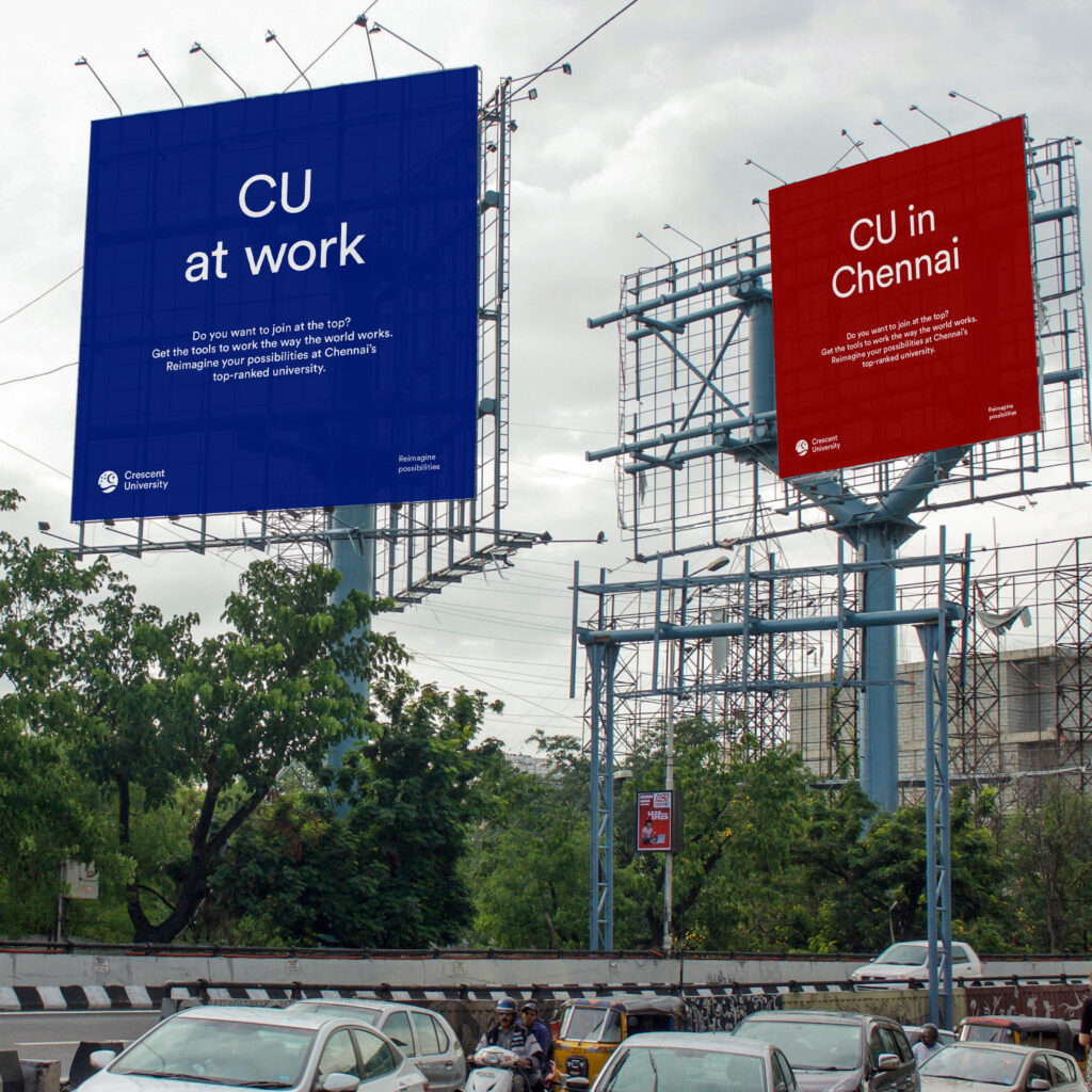
The answer was going back to the school’s roots as founded by a local philanthropist. Promoting entrepreneurship and diversity, the school is located in an area with a large muslim population and was originally dedicated to improving their access to high quality education. Today is it a modern uni with curriculum focused on industry-readiness. CU wants to attract the most ambitious girls and boys from all over the state. As well establishing a new name and visual identity, the effort was also directed at recruitment and finding a voice that speaks to both kids and their parents.
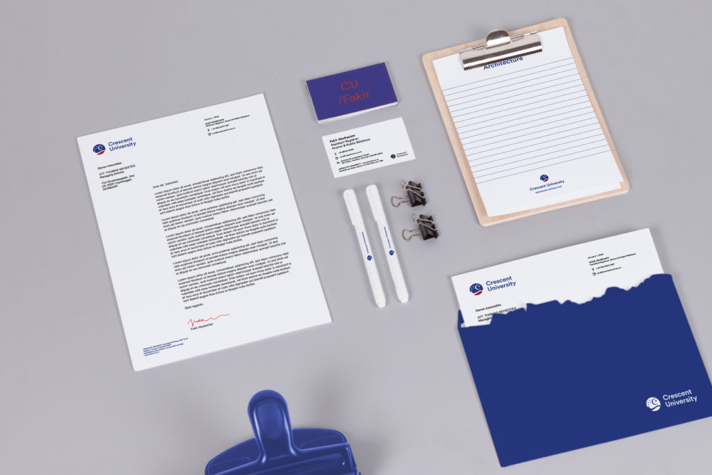
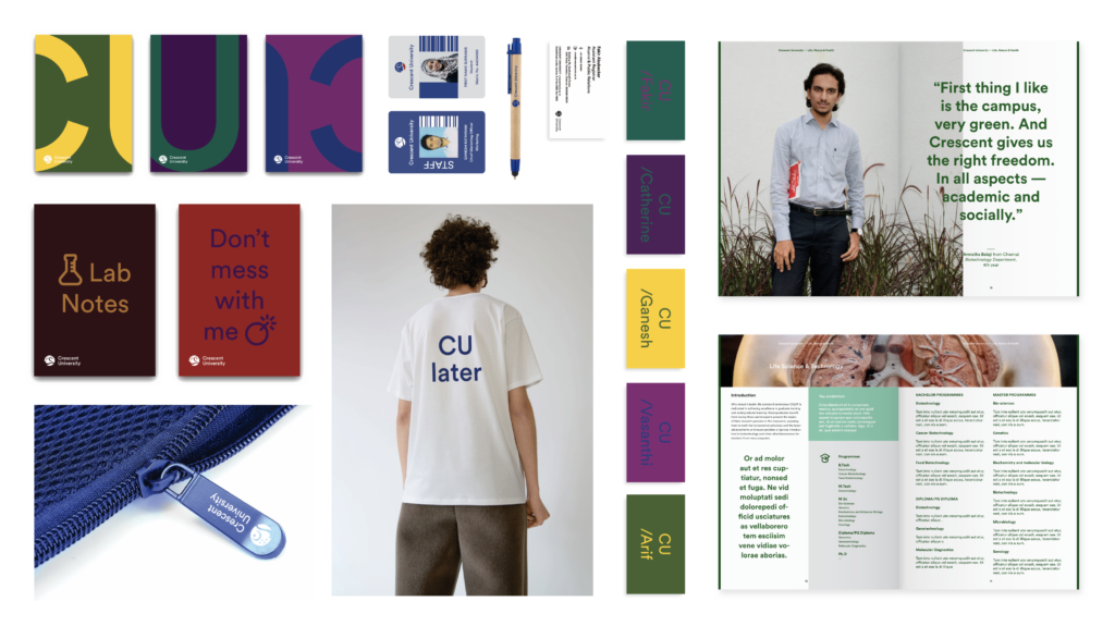
Crescent University got a complete makeover, covering signage, stationery, ads, merch and clothing, icon set, website, brand photography and campaign films. Even their football team got a logo. The new is based on the old, making it an evolution rather than a revolution but for an Indian client in the education space it was a bold move. Not surprising, considering their rolemodel is Harvard.

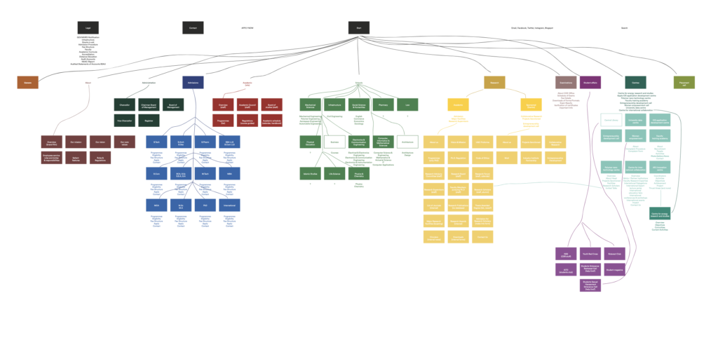
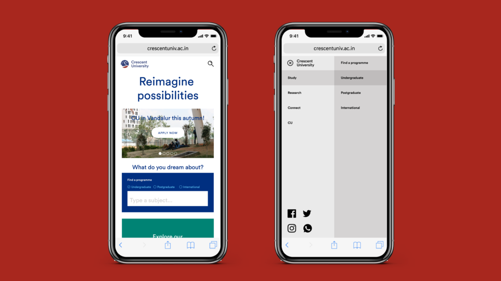
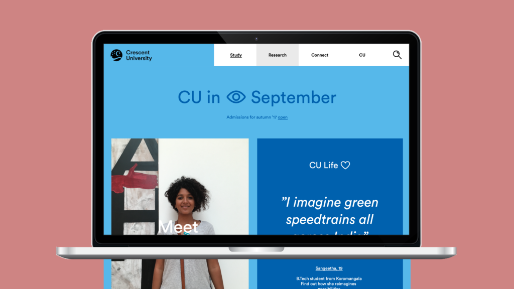
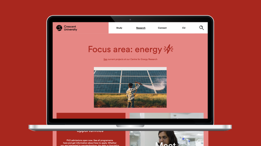
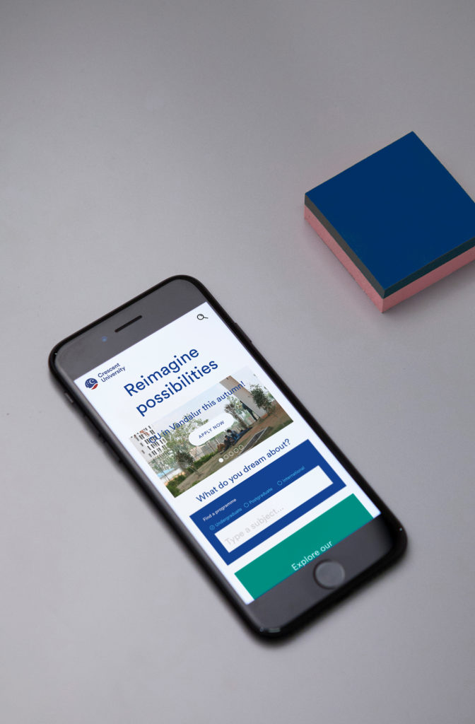
The new website design makes it easy to find programmes and read stories from current students. Going from an old website with many documents still only existing as scanned A4 pages required a new build from the ground up. The new menu structure makes navigation easy and colour coding indicates which part of the site the user is visiting.