Bringing culture to life
What Rebranding
Where In-house
How Strategy, naming, visual identity
Over the course of several months the Soundvenue editorial team, mangement and in-house content studio embarked on a journey to more clearly define its purpose. To guide the business development and primarily the relaunch of their own studio, a new strategic framework was developed. One that would finally bring the whole house together as one – where there had previously been friction between the medium and the more commercial agency working toward partner brands.
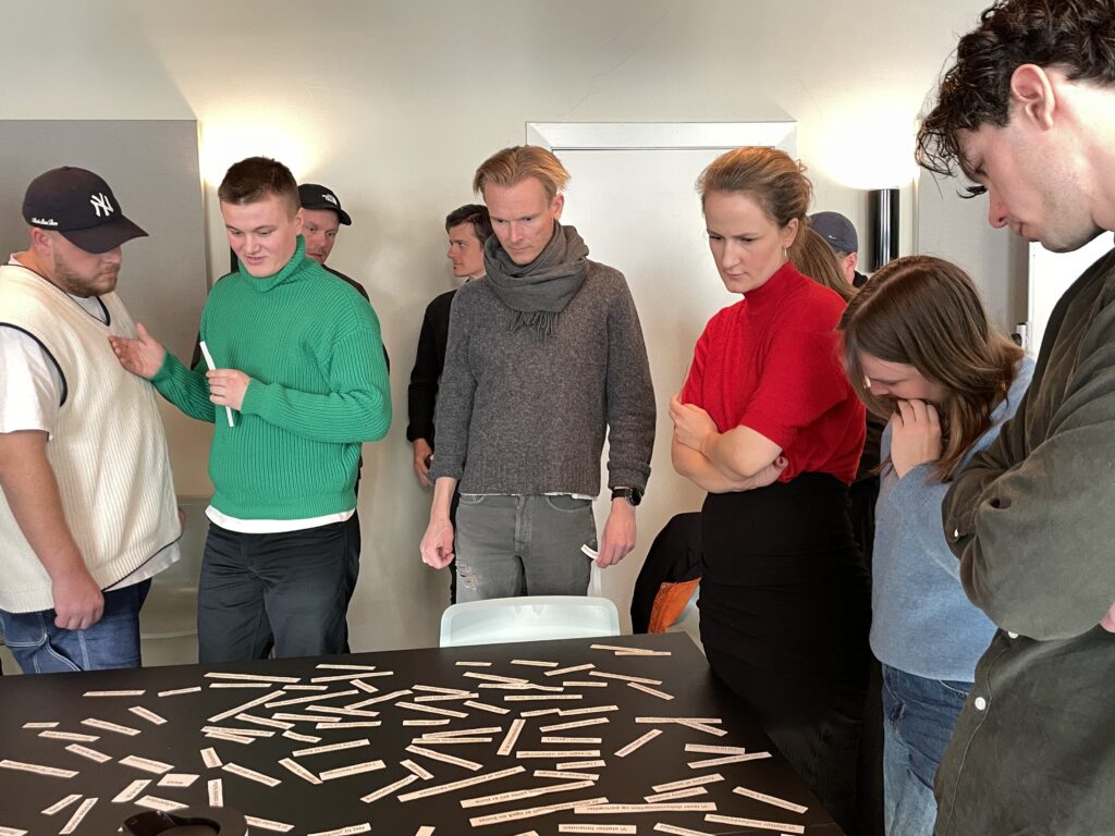
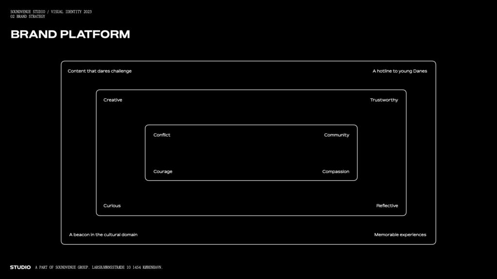
A series of workshops led to an outline for a redefined vision statement for all of Soundvenue Group, a new brand purpose for the in-house studio as well as a brand platform. A new language for speaking towards users started to form. Culture was still at the centre, but acknowledging that sometimes creative differences are what makes the stuff we write about come to life. And that is the same conflict that makes brands stand out as genuine too.
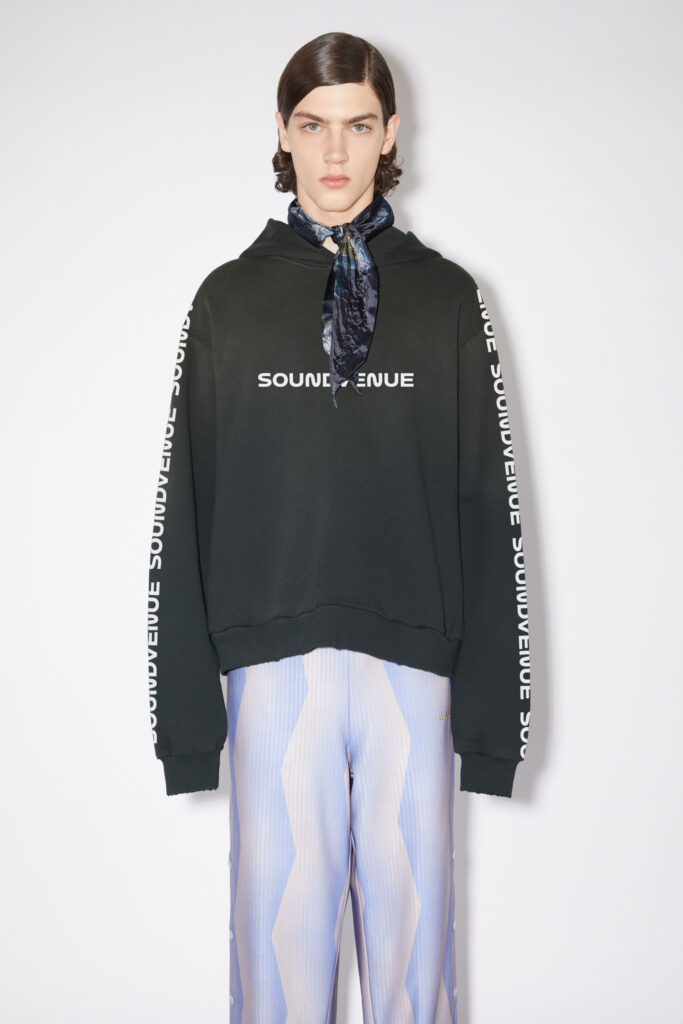
The new purpose ‘solving attitude problems’ became a sounding board for a further process in which a new name for the studio was developed. Soundvenue Creative become Soundvenue Studio. Then the work started on creating a new visual identity that could represent this rather radical redefinition of position.
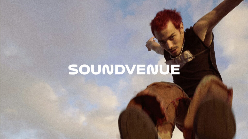
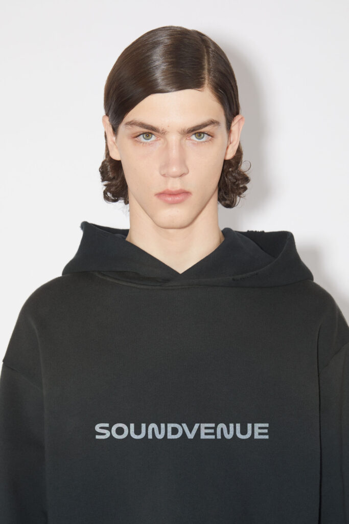
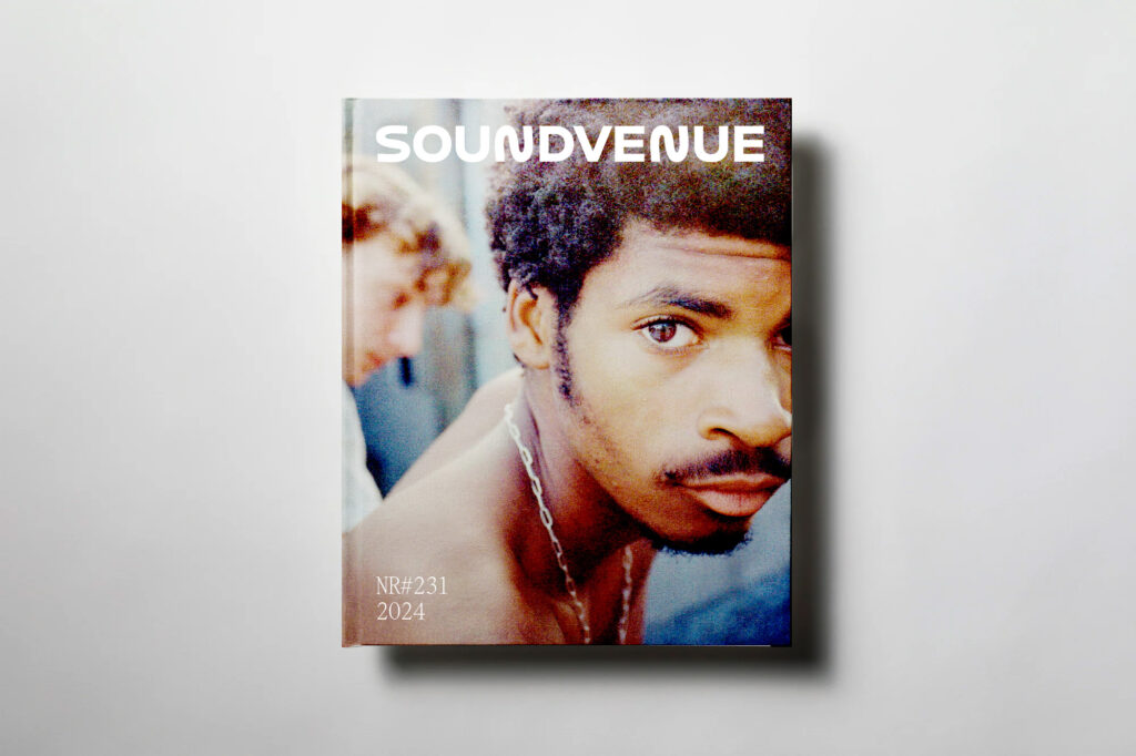
It was clear that Soundvenue as a whole needed to become younger in its expression and better at working with video and motion. Both to keep up with competitors but also to prove to partners that creating digital content is what we’re really good at. In the end, the new identity did not just encompass Soundvenue Studio but Soundvenue itself, which would soon be due a makeover too.
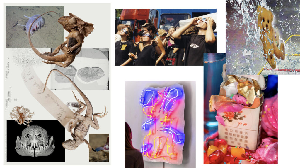
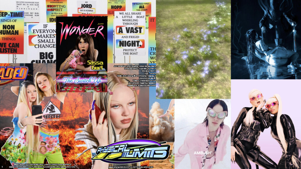
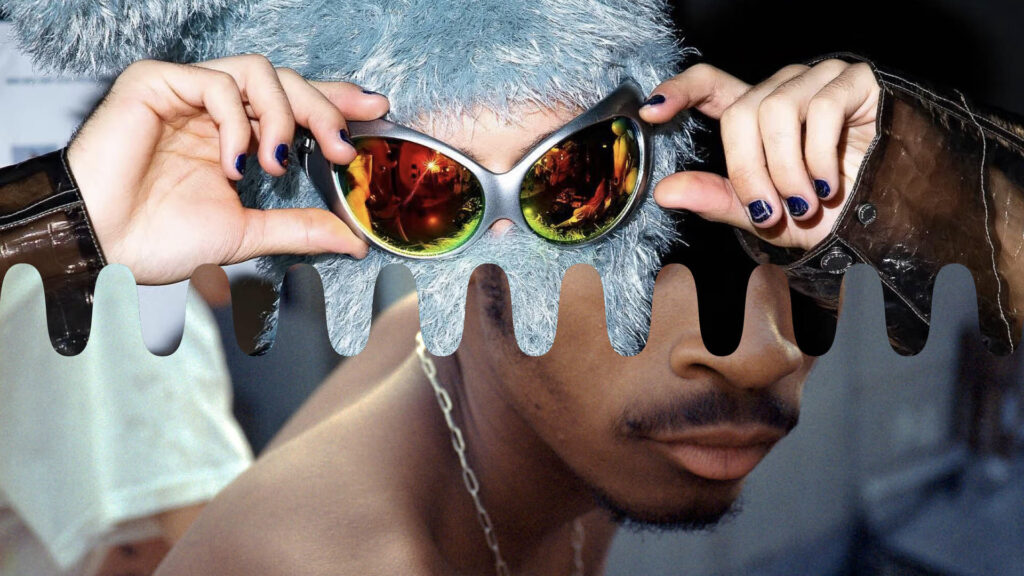
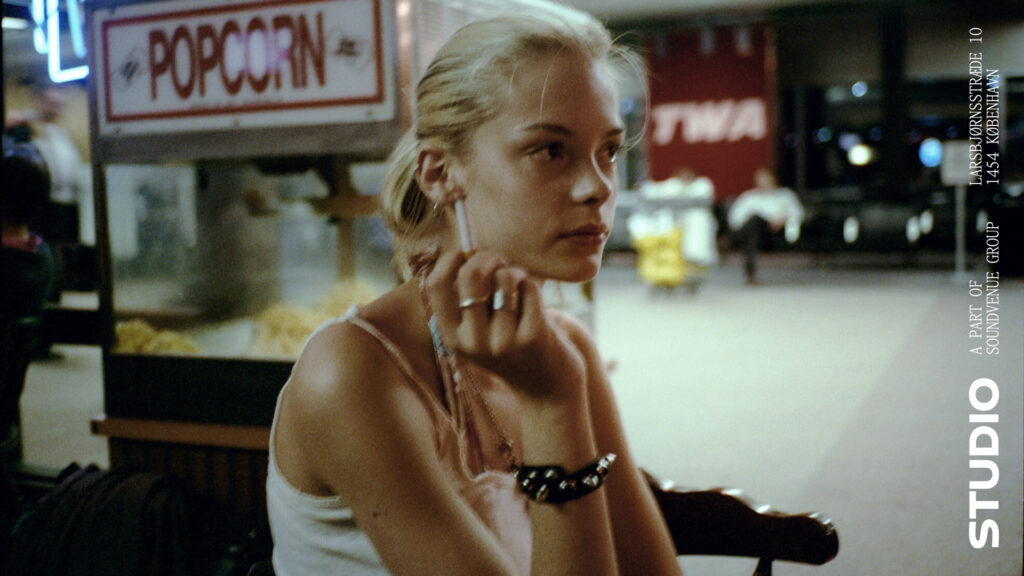
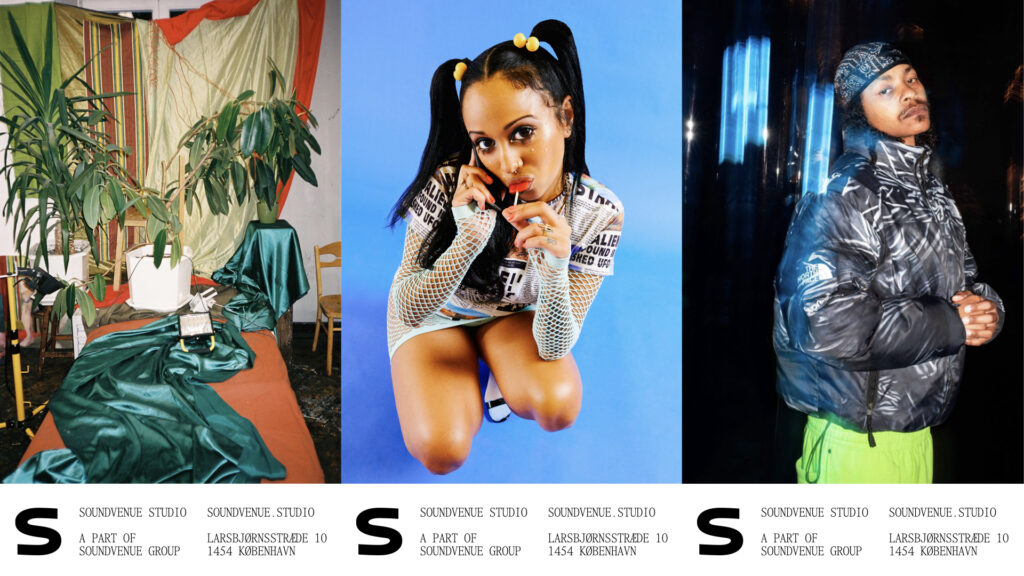
As the moodboards show, the inspiration came us much from current youth culture as from millennial poetic nostalgia. A new logo that builds on motion (horizontally to reference music, and vertically to connect Soundvenue with Studio) was created based on Family Type’s Bossa font. Paired with Items from Schick-Toikka, it encapsulates the conflict between superficiality and depth.
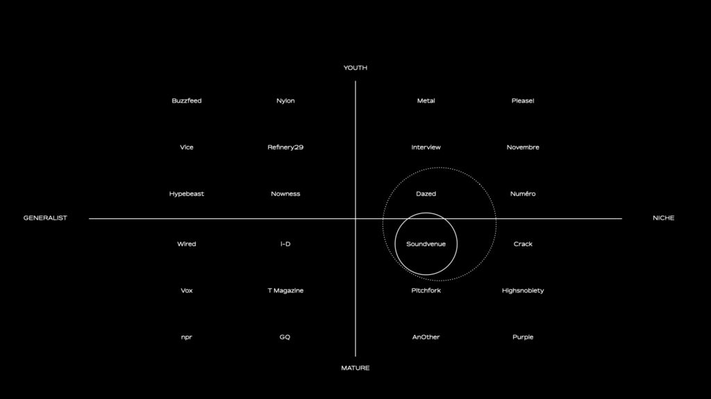
The new identity and logo were created after a full brand audit of the current state of the brand was completed. This pointed to considerable leeway for improvement on both socials, web and overall art direction.
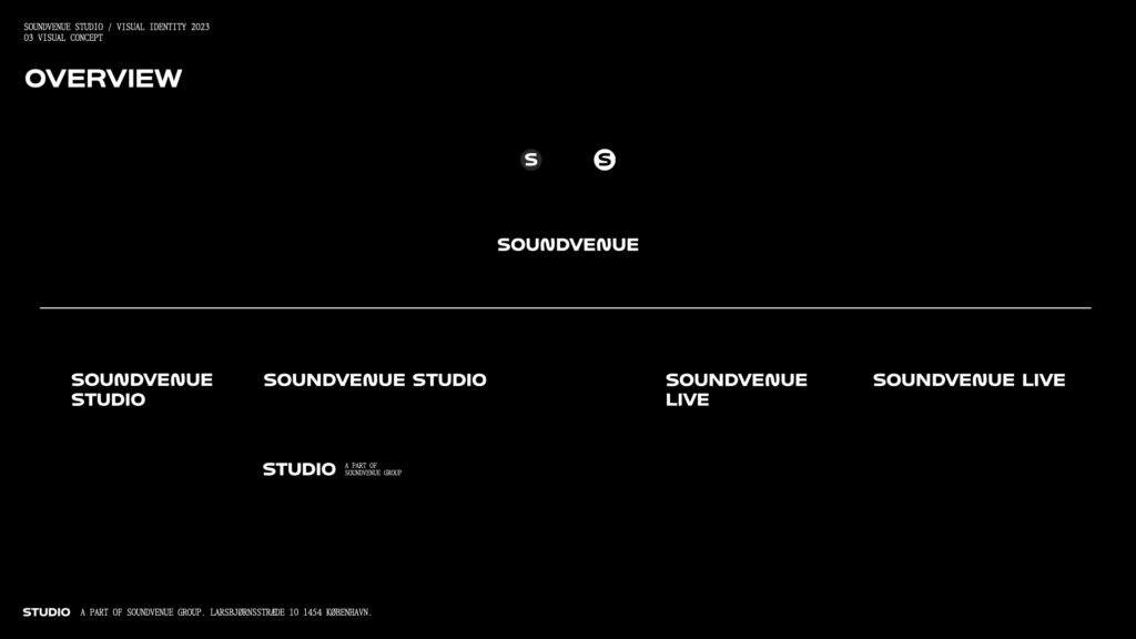
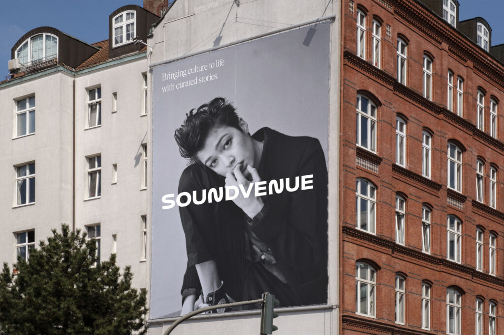
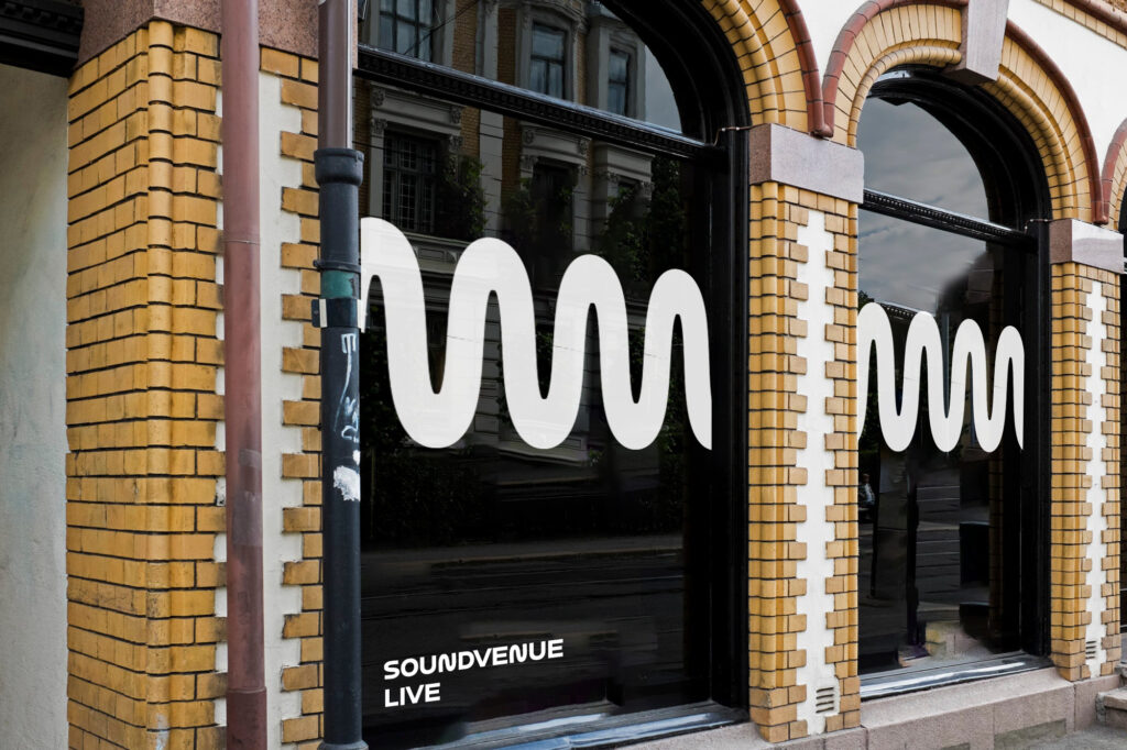
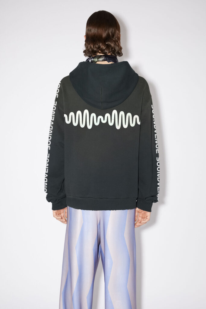
The wave also functions as a fifth element that can be used in merch, interiors, video and on the web. It’s malleable and can take any shape. The wave connects the shape of the S in the logo with the idea of ‘bringing culture to life through curated stories’. The S has been used as an avatar for the brand for years, but had never been particularly distinct before. So it became the natural starting-point when developing a new logo.
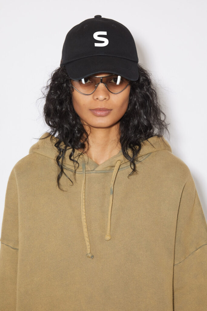
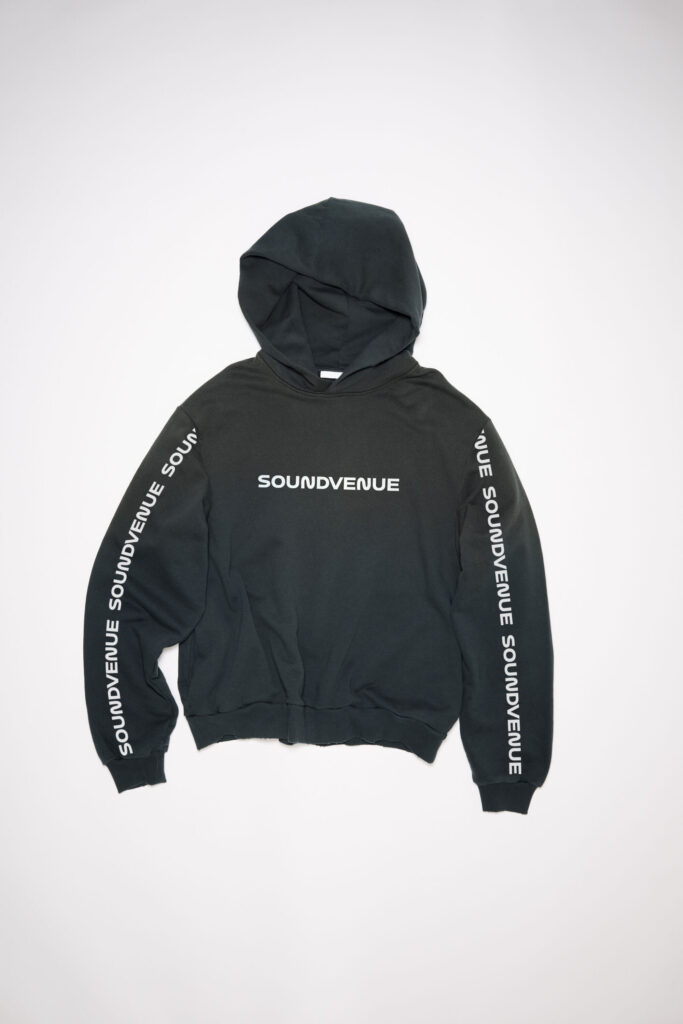
For Soundvenue Studio, their new logo became a natural part of the hierarchy but also more dynamic, since the words can be separated and rotated. A logo animation was created for scrolling states on the web. The rough UX sketches for Soundvenue and Soundvenue Studio websites were created as a part of the identity presentation, but will be developed individually when the time comes.
- Please note that any photography and video has been used solely for internal presentation purposes. All rights belong to the artists and no copyright infringement has been intended. This case includes material from Jiro Konami, Chiara Gabellini, Adam Zhu, Quinn Batley, Kristen Jan Wong, Davide Sorrenti and others.
- Louis McPherson worked on motion graphics.